



Element's new look: another job done well by AI agents under human supervision

2026-09-20

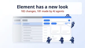
Element has a new look: a blue palette, rounded buttons, soft shadows, new icons and both a light and a dark theme. Underneath, this is not a reskin but a rewrite of the whole frontend from Angular 13 to 18. Of the 182 changes in the code, 181 were made by AI. Below I show what the user sees and what the work looked like from the inside. If you read Polish, there is also a Polish version of this article.

What changed on screen

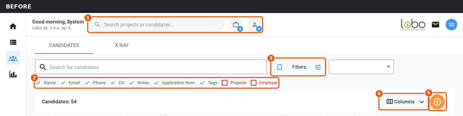
The change is about the look and the position of the buttons. Every function, setting and piece of data stayed where it was, and your projects and candidates are where you left them. The candidate list has the most movement, all of it numbered and shown below as the old view against the new one:

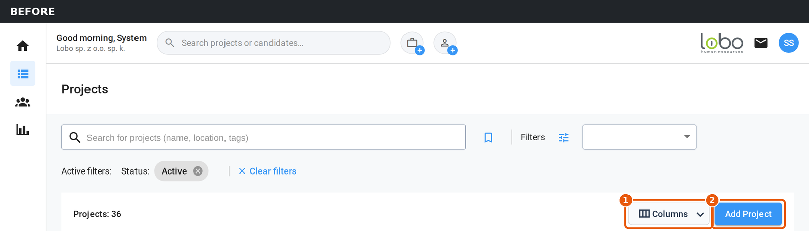
On the project list there is less movement. Columns and Add Project moved up to the top row, next to the search box and the filters, and the number of projects now sits next to the page title.

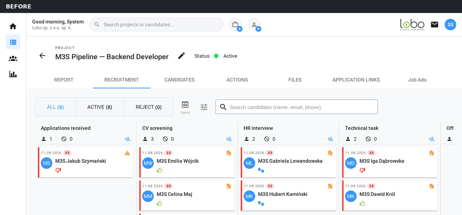
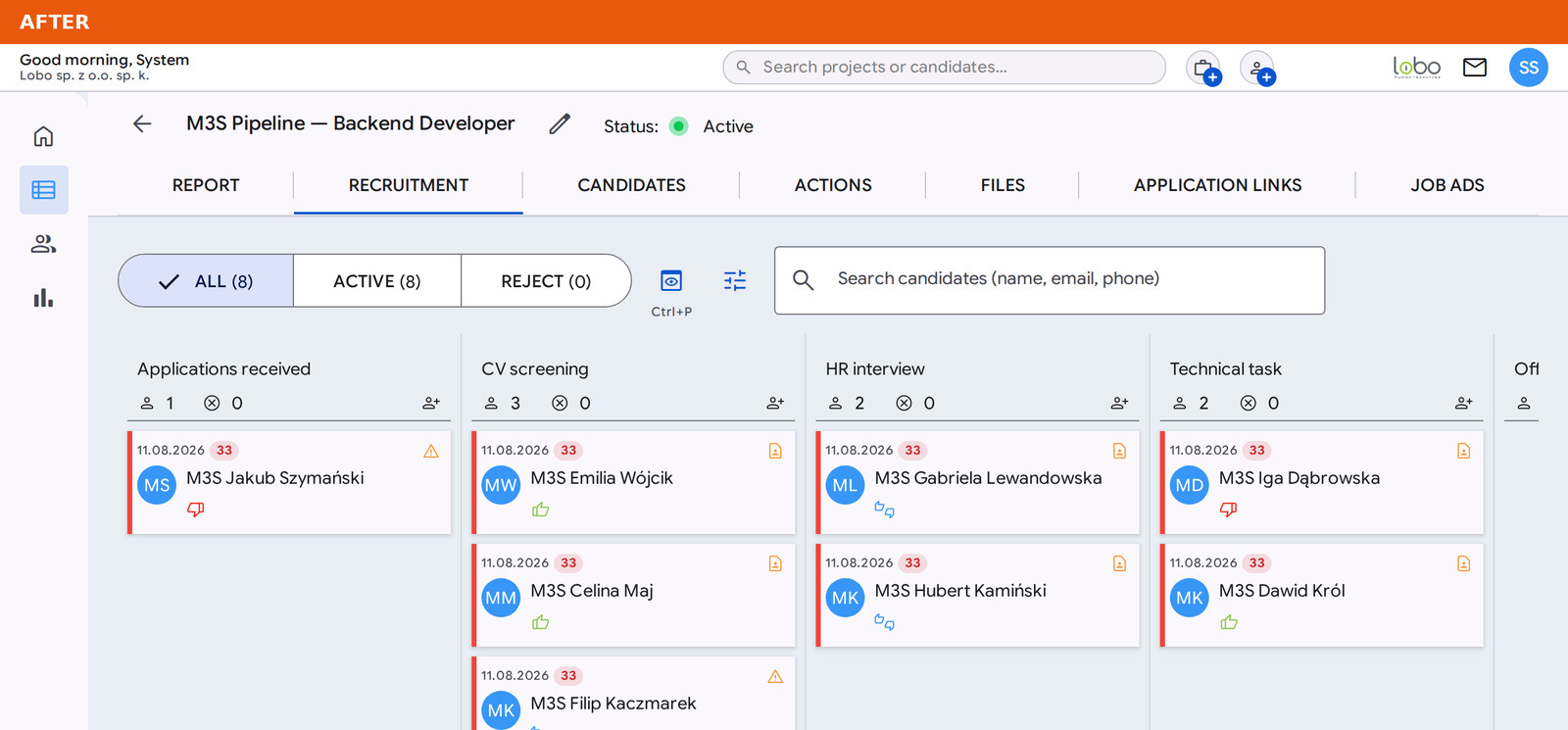
On the recruitment board not a single button moved. The project tabs, the All, Active and Reject filter, the CV preview and the candidate search are exactly where they were, and you drag candidates between stages just as before. Only the look changed, so this pair of screenshots works best as a comparison of the old and the new style.

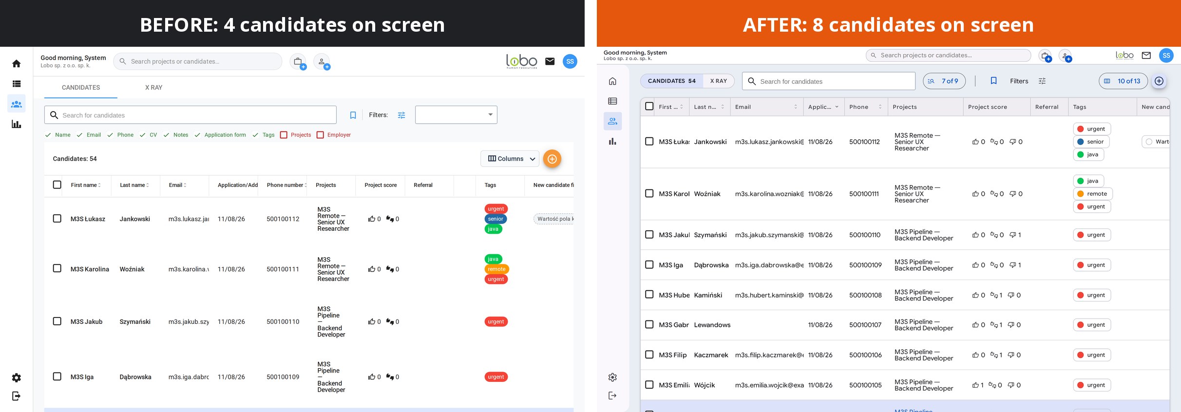
In my view, though, the change you feel most is not about buttons but about room for data. The screenshots below were taken on the same screen with the same data. On a small screen or at a low resolution, the candidate list used to fit four candidates and now fits eight. The tabs, the search box, the search fields and the Columns button used to take four rows above the table and today they sit in one, so the table starts much higher. The same number of columns is visible, but the widths are chosen better: a project name fits in two lines instead of four, and an email address is almost fully visible, which makes every row shorter.

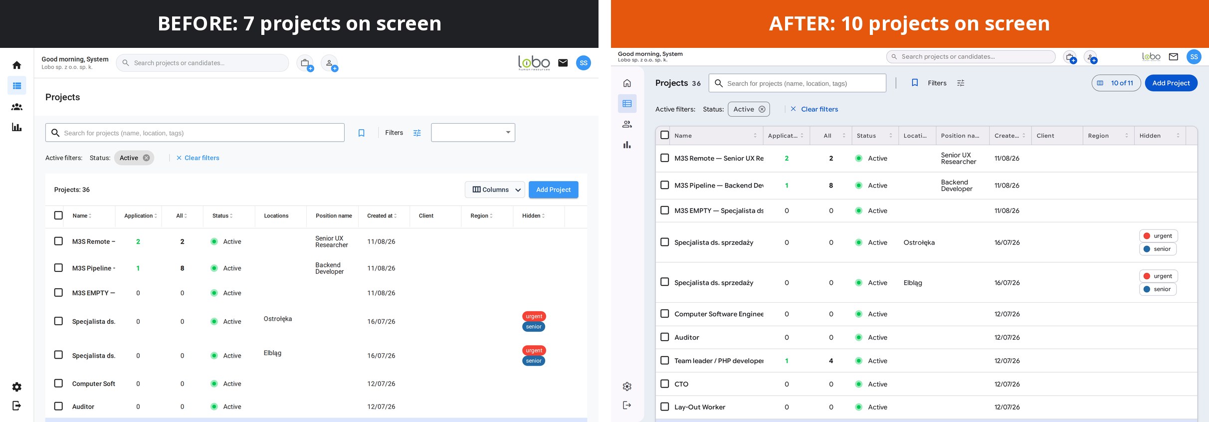
The effect on the project list is similar, and the view on a small screen or at a low resolution is much better. The page title, the search box, the filters and the buttons moved into one row, so instead of seven projects you see ten, and most project names that used to be cut off after two words now show in full.

A few smaller things came along with it, the kind you notice only in daily work. The browser remembers column widths on the project and candidate lists. Transitions between a list and its details are animated, and the system respects the reduced-motion setting if someone has it switched on. Headings wrap more evenly, and the scrollbar no longer pushes content sideways when it appears.

Why this was a rewritten frontend and not a new skin, with some technical detail

At the end of May we had two options. The first was a layer of our own styles on Angular 13, a quick swap of colors and rounded corners. The second was a full framework upgrade and native Material 3 on top of it. We took the second one, because I wanted to do it properly from the start, without compromises.

You cannot jump an Angular version in one go. You have to go version by version, 13 to 14, then 15, 16, 17 and 18, and each of those jumps has its own migrations. With a change this large there was no way to avoid surprises. Three libraries had to go, because nobody has maintained them for years, and one of them flatly blocked installation on the new Angular.

How much of this the AI agents did

As I mentioned at the start, the work described here covers 182 changes. 181 of them, that is 99.5%, were authored by AI agents. The project was run by Fable, which delegated tasks to other, cheaper models: Grok 4.6, Codex 5.6 luna and Sonnet 5.

MeasureValue
Commits on the redesign branch182
Commits co-authored by AI181 (99.5%)
Files changed615
Code changes (excluding the dependency file)+13,438 / -5,205 lines
TypeScript / SCSS / HTML files392 / 119 / 66

The agents wrote the code, but the direction and the call on what goes forward and what comes back for a fix stayed with me. In my training sessions I keep saying that the bottleneck stops being the writing of code and becomes checking whether what came out actually works. This migration is one more example of that.

I am not claiming that every project can be done this way. This one had four things going for it where agents are concerned: a clear visual goal, a framework with documented migration paths, a test suite that said plainly after every step whether something had broken, and most importantly control over the project, including code quality, exercised by our senior developers.

The help center written from scratch

The new look invalidated the screenshots in the help center, so I asked Claude to go through it article by article. We mapped 46 help center articles and audited 45 of them, in every language version. We found and fixed 94 discrepancies between the text and what is actually on screen, and we added 101 new screenshots. Had I been doing this myself, it would have waited a long time, taken many hours, and I would have done it very reluctantly. All the articles are at help.elementapp.ai.

What comes next

The new look is already in production, and users have a help center with refreshed documentation. As always, the fastest help for our users is the chat, where we answer within minutes, seven days a week.

Finally, thank you once again to our developers for their reviews and for supervising the agents’ work. Without their eyes on it, this change and every other change in Element would not be possible.

Read more about what an ATS is and how Element works here.

DISCOVER ELEMENT!

Fast, agile and user-friendly ATS created by recruiters for recruiters
Picture of Maciej Michalewski

Maciej Michalewski

CEO @ Element. Recruitment Automation Software

Facebook
Twitter
LinkedIn

Recent posts: